Delivering on 21st Century IDEA: A case study from the GSA SmartPay team (Part 3)


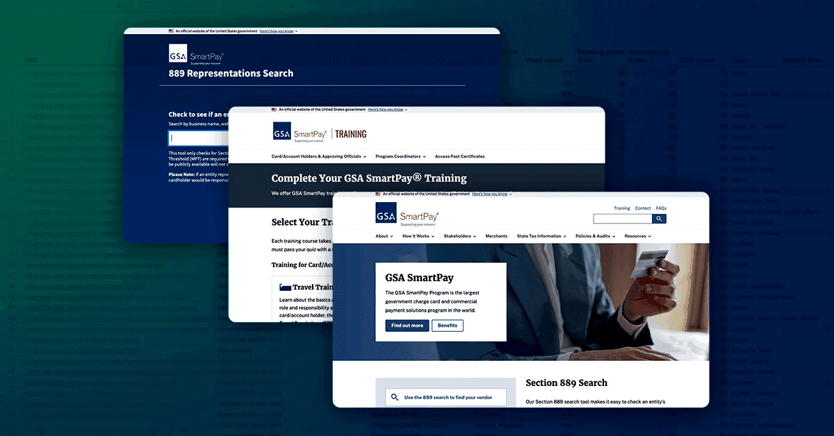
This is Part 3 in a three-part series with the U.S. General Services Administration (GSA) Center for Charge Card Management (CCCM) about building their new, open-source program and training websites, and the new Section 889 web app.
For this post, Ryan Johnson, a content strategist on the GSA Service Delivery team, chatted with product owner, Rebekah Perillo. Rebekah is a lead business management analyst with CCCM.
Ryan Johnson: Hi Rebekah! Thank you for joining me to talk about our work together to modernize GSA SmartPay’s websites.
Rebekah Perillo: Thanks so much, Ryan!
Ryan Johnson: Can you tell us about your role at the Center for Charge Card Management and how you became involved with the GSA SmartPay website modernization effort?
Rebekah Perillo: I serve as a Team Lead on the communications side of the house within the Center for Charge Card Management (CCCM). My colleagues and I work on tasks involving customer outreach, social media, training (including our yearly forum), and our websites. Several months into the website project, I was pulled in to help vet, reduce, and standardize content for the new program and training websites. When they approached me, little did I know or understand what that involved.
Ryan Johnson: When you joined the website projects, our team (Service Delivery) had completed a content audit of the main GSA SmartPay website. What were your initial thoughts about the content audit?
Rebekah Perillo: First, I was amazed by the sheer amount of content that was residing on the program website. There were over 500 pages, PDFs, and spreadsheet reports. That’s a lot of content! Second, the corresponding analytics showed that most of that content really wasn’t being viewed by users. By examining the results of the content audit, it started to tell the story of the current state of our website and where we needed to go.
“ By examining the results of the content audit, it started to tell the story of the current state of our website and where we needed to go. ”
Ryan Johnson: As our teams worked together on web content, it was evident there were inconsistencies in program terminology, which led to the development of a content style guide. Can you tell us about the challenges and benefits of that process?
Rebekah Perillo: On our legacy program site, many different people over the years created and posted content. Everyone had their own style and preferences on how to refer to common parts of the program. By reworking our content for the new program website, it finally gave us the chance to be consistent—which is one of my favorite words and things—by leveraging the GSA style guide to create a program-specific style guide.
Several CCCM team members and I got together to discuss and document how to represent standard terminology within our program. And, the beauty of it, is that the guide can be used for all of our communications materials, not just for the websites. It was a bit challenging to agree on standards for some of the items, but finding the time in our busy schedules to sit down together to create the guide was the most difficult part of it.
Ryan Johnson: You were instrumental in consolidating content and removing ROT (redundant, outdated, trivial) information, ultimately reducing the main website’s content volume by 75%. How did you go about doing that?
Rebekah Perillo: Really, the content audit led the way, along with our direct knowledge from working with our customers. We used this information to narrow down the major topics that needed to be covered on the program website. Then, once we started to edit each topic’s content, we tried to ensure that the content was to the point, current, and readable.
Ryan, you taught me that users come to our website to complete a task, so let’s make it easy for them! We want users to quickly find what they need and complete the task, so they’re able to focus on other valuable work.
“ Users come to our website to complete a task, so let’s make it easy for them! ”
Ryan Johnson: Reducing content on any website or digital product can be a difficult task and often requires buy-in from others in the program. How did you build support in the program for the content work?
Rebekah Perillo: Management gave me the freedom to reduce content as I saw fit. Pain points still exist though…even now, after launch. We’re still working to spread the message internally that the user’s needs trump our own opinions about content and supersede our previous content practices. Our goal is to continue to be mindful about what content is changed or added to the sites from here on out.
Ryan Johnson: After you streamlined the content, we worked together on a new information architecture for the website. What were your thoughts on that process?
Rebekah Perillo: It was a great opportunity to take a look at all of the newly updated content and organize it in a thoughtful way. We participated in a card sorting exercise where each piece of content was listed on a card. Then, we were asked to group the content that we thought belonged together. Lastly, we named each grouping based on a theme. It proved to be an excellent starting point to reorganize the website that we further refined with usability testing.
Ryan Johnson: Accessible content design was a big focus of our work together. Has that focus on accessibility changed the way the program thinks about web content going forward? If so, how?
Rebekah Perillo: My big take away was that accessibility is so much more than 508 compliance. For example, if you provide alt-text to an image, you’ll be considered 508 compliant, but you may not truly be accessible if the alt text doesn’t fully describe all pertinent aspects of the image.
So, in addition to our extensive automated testing, we also conducted manual accessibility testing to make sure our websites weren’t just compliant, but also user-friendly for people using assistive technologies.
Accessibility and inclusion are everyone’s job, and should be a main consideration when creating content. We want all users to have the same experience on our websites.
Ryan Johnson: You had a lot of responsibilities in your role as product owner on these projects. How did you balance the content work with all of your other responsibilities?
Rebekah Perillo: Thankfully, I shared many of the day-to-day product owner responsibilities with my colleague, Andrew Lee. However, the content work was my task to complete. Management gave me the space and time to examine and thoughtfully work on content, making it a priority. I’m grateful they understood that many of my other job responsibilities had to be put on hold until the content work was completed. Content work can really be a full-time job – it requires quiet, concentration, and thoughtfulness to get it right.
“ Content work can really be a full-time job – it requires quiet, concentration, and thoughtfulness to get it right. ”
Ryan Johnson: Do you have advice for other government programs who want to get a hold of their website content and make it more user-centered?
Rebekah Perillo: My advice is a resounding Do it!. In my opinion, over the years, so many government program websites have become overgrown with content. Rather than judiciously choosing what to display, they continue to add more content. With so much content on a site, it’s difficult to make sure it’s all current, working, and accessible. So, if they’re given the opportunity to update their content to resonate with users, I hope they jump at the opportunity, even though it’s a lot of work.
Ryan Johnson: The new GSA SmartPay websites launched in early October. How’s it going so far?
Rebekah Perillo: So far, so good! It’s been very boring—we haven’t discovered many bugs or had significant complaints from users—which is the biggest compliment to the team. Customers seem to be happy! They’re able to access content and training to do their jobs. And, now that the MVP (minimum viable product) is launched, we’re focusing on how to build the websites to further meet user needs.
Read part 1 and part 2 for more information about the GSA SmartPay project.