Making targeted improvements to NPS.gov: A case study from the National Park Service

How can we best serve our customers? The only way to really know is to ask them.
Browsing habits on NPS.gov changed over the past decade
The National Park Service’s National Capital Region includes a number of historic, cultural, and natural landmarks — from the Washington Monument and Lincoln Memorial, to Civil War battlefields, to natural areas with hiking and camping. It is also one of the many metropolitan areas in the United States with high-speed internet and wireless access.
Half a billion people each year use the National Park Service website (NPS.gov), and the Digital Analytics Program (DAP) is vital for the National Park Service to serve these customers. Through the DAP data, we are better able to understand both basic page statistics and observe long-term trends and changes in user behavior.
We frequently look at the DAP data for websites of landmarks within the National Capital Region. One goal in the early days of DAP was to gauge the influence of mobile devices. For example, if a large proportion of our traffic was shifting toward mobile devices, how would we need to adapt to that growing market? We also tracked a variety of data points including sessions, pageviews, bounce rate, and sessions and pageviews broken down by age demographics.
Related guide
Check out the glossary of terms to browse common terms that you will need to understand when using DAP.
The study yielded a few key trends over the sample period from 2014 to 2024:
- The proportion of mobile device usage (versus desktop or tablet) grew to become the majority of our traffic, both in terms of pageviews and sessions.
- Overall bounce rate increased steadily over time. This change was primarily because the bounce rate among desktop users increased (more users were leaving after viewing only one page).
- Younger people were bouncing faster than older people. Older people were consistently more likely to view more pages per visit.
- Pageviews per session fell among all age groups.
Users are more likely to be on their phones
Since 2014, mobile sessions and pageviews have both increased steadily in the National Capital Region to become the majority of the region’s traffic on NPS.gov. Today, most web pages on NPS.gov are viewed on a mobile device, not on a desktop. Thankfully, NPS.gov adopted a mobile-friendly website in 2015, along with other improvements to ease browsing for mobile device users. Although the rate of growth has slowed, the percentage of our website traffic on mobile devices continues to inch upward.

One piece of this trend is the rise of mobile devices, but that’s not the whole story. While more pages are being viewed on mobile devices today, the percentage of the traffic on mobile is also attributed to a decline in desktop computer pageviews. It’s interesting to note that more and more people tended to prefer to view NPS.gov on their mobile device over time.

Users are less tolerant of browsing
At the same time, our audience changed not only in how they accessed the information, but how they interacted with it. This change was most evident in the bounce rate, which climbed steadily over the sample period.

While mobile device users have consistently been the most likely to bounce from a webpage, mobile device bounces remained essentially unchanged over a decade of observation. What has changed is every other device type’s bounce rate has climbed. We hypothesize that this change is due in part to:
- Search engines have become more and more likely to deliver users to specific results deep in a website and
- Users show a lower tolerance to spend time looking around for what they need.
For us, one clue is that pages other than a park home page are the source of a large proportion of the “entrances” on a park website. There are some web pages like that in the National Capital Region, such as the Washington Monument tickets page or the Martin Luther King, Jr. Memorial quotations page — both of which get more traffic than their respective park homepages.
Consider your own browsing behavior. Are you more likely to look around or more likely to hit the “back” button when you don’t immediately find what you were looking for? The data show that younger people tend to bounce more often than older people. The chart below tracks pageviews per session by age group from 2016 to 2023.
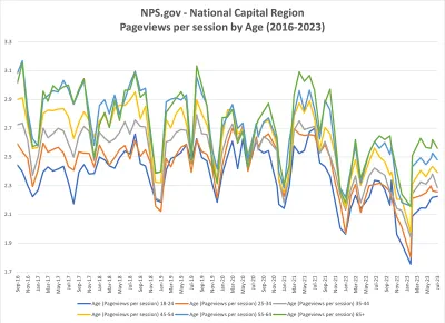
Consistently, the older a user is, the less likely they are to bounce. And yet, across the board, pageviews per session fell steadily for all age groups, with a particularly sharp drop by 2021. This trend corresponds with a falling rate of desktop web page visitors, and a higher bounce rate among desktop users.
Asking users “Was this page helpful?”
Based on the DAP data, we know users are more likely to be on their phone and that their tolerance to browse is lower than ever before. While DAP is great for getting quantitative data about what people look at on the website, it doesn’t answer qualitative questions about how they felt about the experience, or whether they found what they were looking for. After all, a bounce isn’t necessarily a rejection; it’s possible the page served the user’s needs and they moved on.
So, how can we best serve our customers? The only way to really know is to ask them.
Historically, we have used surveys to poll our audience and provide insights as to the user experience. On the macro scale, these surveys helped us understand the entirety of the NPS.gov experience. But because of sampling, not all parks and their web authors got actionable information from these surveys on the park level.
We needed a way to help us collect page-level feedback on whether we had served our audience. In January 2023, we started using Touchpoints to ask “Was this page helpful?” on most NPS.gov pages. With Touchpoints, site visitors have the opportunity to provide a “Yes” or “No” answer about whether a page was helpful and provide an optional comment.
In partnership with the DAP team, as part of a limited pilot, we added the survey as a DAP custom event to send and report the responses in the DAP reporting portal to see and analyze all of our data in one place.
After the survey had run for most of a year, we analyzed the data and prepared a list of national park websites with “Was This Page Helpful?” scores that, if improved, have the potential to change the NPS’s overall score the most. The report flagged the website for the Frederick Douglass National Historic Site, among others, as one opportunity for improvement.
The Frederick Douglass website is fairly routine for the National Park Service. The site is organized like other park websites with useful resources for trip planning and learning more about the park — in this case the history of Frederick Douglass, his family, and his home. It wasn’t immediately evident to us what was causing the scores to be so low.
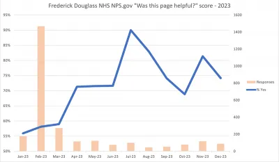
Using DAP data, we have long known that traffic on the Frederick Douglass NHS site spikes in February — Black History Month. With that information alone, we might conclude that people are interested in Frederick Douglass that time of year. On its own, that fact seems like a win for the National Park Service. We had assumed that if we have good information on Frederick Douglass and many people view that page, we’re doing our job. As it turned out, the spike in traffic had a corresponding spike in survey responses — responses that tended to be more negative than the rest of the year, dragging the overall score down.
For most of the year, most people visit this website to plan a visit to the historic home. And for most of the year, the score stayed in the 75% to 85% range. However, February brings a different crowd to the website: students who are doing research for school for Black History Month. A peek into the comments and the scores in February clearly shows students were hitting the site and not finding what they needed.
The comments generally showed that students were looking for information about Douglass, but were on the “wrong” webpage within the site. For example, they were on a basic information page about visiting the park instead of a biography of Frederick Douglass. Responses seemed to indicate they had not read the content on the website thoroughly or looked around for information. Some visitors clearly didn’t understand that they were on a national park website about a historic home, not a website dedicated to all the facts about Frederick Douglass’s long, notable, and full life. Knowing all this, we had opportunities to improve the experience for this audience.
Taking action to improve the Frederick Douglass website
By the time we’d done the research and identified the issues, it was mid-January 2024 and the park’s staff were occupied ramping up for all their upcoming Black History Month events. So, with limited time and resources, what could we do to try to improve the helpfulness score of the website?
Because of our constraints, we looked for simple solutions to help improve the site.
First, we wanted to make it easy to find the key facts students might want. We added a brief synopsis of Frederick Douglass’s vital statistics at the top of his biography page to highlight these basic facts and make it easier for readers to find.
Second, we wanted to make it easy to find biographical information. On the homepage, we updated a title to say “Who was Frederick Douglass?” and promoted it higher up on the page. We also removed some clutter from the page.
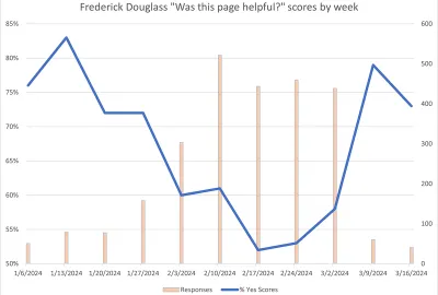
Unfortunately, for the first set of students, we didn’t get the changes deployed before February 1. As Black History Month began, the negative responses started pouring in, and the site’s “Was this page helpful?” score plunged from 72% the last week of January down to 45% during the first four days of February. The daily score bottomed out at 38% on February 2.

Fortunately, for the data analysis, we had established our baseline for what no action had done for the site: more than half our audience found the content unhelpful.
As we rolled out the changes to make the biographical information easier to find, the score began to inch upward. Weekly scores were between 53% and 61% for the following weeks. While these were still not ideal scores, it was encouraging to have been able to use the data to identify the problem area and at least push things in the right direction. As soon as Black History Month was in the rearview mirror, the score returned to its usual range between 75 and100% satisfaction as the core audience of national park visitors once again made up the majority of visitors to the website.
It was impressive that such a small change made such a big difference during Black History Month, but we couldn’t have completed that surgical strike without the data to locate and understand the problem.
Through this pilot with DAP and Touchpoints, we were able to demonstrate the value of doing our best to understand our audience and serve them.
What’s next for our team?
In the past decade, we’ve seen major shifts in how people browse our websites. Through the data, we’ve been able to make informed decisions, adapt our strategies, and apply resources effectively in an ever-changing environment.
Having the will and the means to collect and analyze the data is foundational. But, we also need to understand our audience and their needs and motivations to ensure we do our part to deliver a good online experience. Describing the challenges with data and developing the strategies to tackle these challenges must go hand in hand.
So based on what we know about our audience — namely that they are ever more impatient — what can we do to better serve them?
Allowing a user to explore areas of interest at their own pace is a cornerstone of the audience-centered experience, which the National Park Service and many other museums and cultural institutions have embraced. While answering basic questions is foundational, we must also build content that may be interesting to explore for someone taking a deep dive (as NPS rangers often do!), even if it isn’t for mass appeal. We must also ensure that the information is interconnected on our sites. As search engines mine deeper into websites to serve more and more specific results to their users, we need to provide a strong foundation of quality information on the platforms we control.
We can do amazing things when we have the data at our fingertips, and it’s essential that we have a strong cadre of federal professionals who can access, analyze, and interpret the data to inform agency strategies and better serve the public.
What can you do next?
To gain specific insight into user behavior and experience as they visit web pages of federal government websites, agencies can explore the option of using Touchpoints “Was This Page Helpful?" survey as part of the DAP data collection and reporting.
Activity
Get started with Touchpoints
Add the Touchpoints survey as a DAP custom event to send and report the responses in the DAP reporting portal to see and analyze all your data in one place. Contact dap@gsa.gov to participate in the pilot.