Fueleconomy.gov – Extended Case Study
Like any valid business decision, User Experience work should produce results and demonstrable impact. To see a list of screenshots from websites we’ve improved, visit the rest of our Usability Case Studies. Or see a more complete case study below.
Case Study: Fueleconomy.gov Mobile Site

After reviewing metrics, business goals and top tasks for fueleconomy.gov, we worked with their team to develop interview questions for their customers. We selected and called six users and potential users about the site and their habits online. Using those user interview results**** (Word document, 36 KB, 5 pages, November 2013), we developed a usability test script (Word document, 232 KB, 13 pages, November 2013). We spent about a month preparing for the test, and scheduled it in February of 2013.
We invited the fueleconomy.gov team to observe the test so they could learn about usability and how a test works. We also invited other agencies to the test as well. We tested three people, and focused on what people said were things they were most interested in, or were confused by. The customers gave real, unbiased feedback about things they liked and didn’t like.
The fueleconomy.gov team took the usability report (Word document, 190 KB, 7 pages, November 2013) and made some small but powerful tweaks to their site. Here are three issues they fixed:
Problem 1: Terms Unclear
Users were confused about the differences between “My MPG” and “Find a Car” on the homepage.
Solution 1: Clarify Terms
The “My MPG” was changed to “Calculate My MPG” and “Find a Car” was changed to “Find and Compare Cars.”

Problem 2: Hard to Find and Misleading Buttons
Users were confused by the “Add a Car” button or missed it.
Solution 2: Clarify and Move Buttons
The “Add a Car” button was changed to “Compare Cars” and added to the top of the page so that users could find it.

Problem 3: Lack of Help Buttons and Explanatory Text
There was no “Help” button or explanatory text for users when they encountered unfamiliar words or acronyms.
Solution 3: Clarify Terms
A “Learn More” button was added to the bottom of several pages, including the Greenhouse Gas Emissions, Annual Petroleum Use, and EPA Smog Score pages.

The fueleconomy.gov team implemented these and other changes based upon user feedback and data collected in the test. Then, they collected metrics to see how the new version was impacting customers. The results were outstanding:
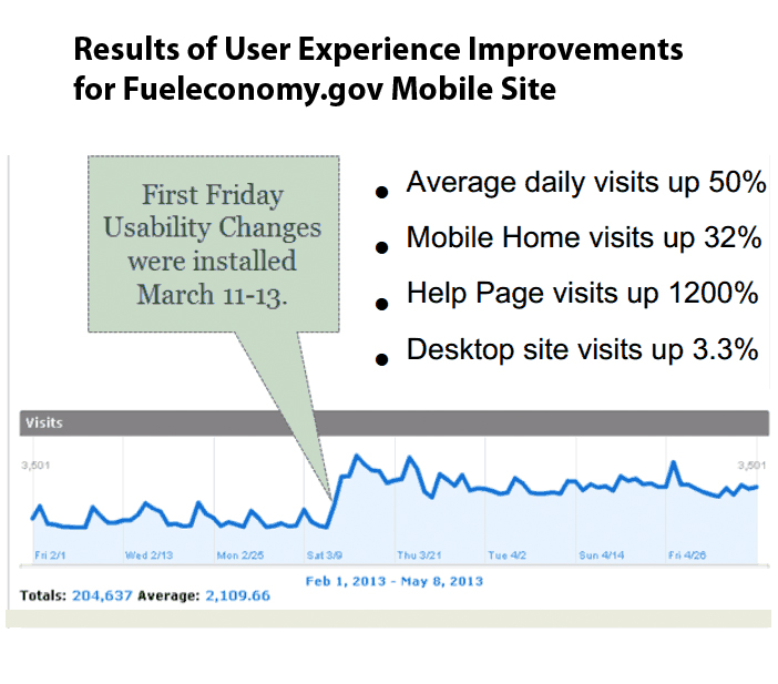
Users were able to find information on the site, and enjoyed it enough to come back again. Their team was happy, and so were we. See our Before and After Gallery for more screenshots of government products improved by User Experience work.