Open Source Content Management Systems and Responsive Web Design Webinar Recap
Most of us in the DigitalGov community recognize that responsive Web design is one approach to mobile first and most of us have a pretty clear picture of what it means—a responsive website will adjust to different devices, and the content will neatly change its layout from one screen size to another.
But do you know how it happens? Would you know how to implement responsive Web design in your agency? The “Mobile Web Templates: How to Use Open Source CMS to Implement Responsive Web Design” webinar (embedded below) gave us the tools to say yes to these questions.
[youtube=http://www.youtube.com/watch?v=iKeh25cKgrY&w=600]
As we’ve been learning since the February workshop on the topic, federal Web managers are using a number of solutions to implement responsive design on their sites, including structured data and content models, APIs, and/or leveraging existing content management systems (CMS). Last month’s webinar featured three speakers presenting solutions that use open-source CMS: Ryan Day from the General Services Administration, Eric Brassil from the State Department, and Karen Trebon from the General Services Administration.
Drupal at GSA’s Child Care Information Portal
Ryan Day’s presentation covered how his team used Drupal to implement responsive design during the rebuilding of their Child Care Information Portal. In Drupal, themes are a major component in determining how your site will function, and Ryan stressed the need to pick the right theme—one that will meet your content needs AND is responsive—and let it do the heavy lifting for you.
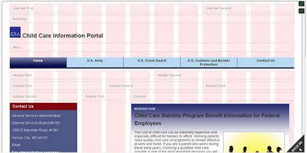
Ryan went on to show us how to configure Drupal, and his team’s chosen theme Omega, so that it will rearrange your site’s content display based on your user’s device. Within Drupal, you can define a region type for each block of content, so that your CMS knows what is top-level navigation, what is sidebar navigation, what is main content, etc. Additionally, the Omega theme has another level of configuration, sections and zones, that allow you to identify where the different regions should move to as your user’s screen width narrows. You can even define different CSS styles for different device widths.
Much of this configuration is possible due to media queries, which are scripts that allow your site to assess the width of a user’s screen and use this information to make key layout determinations. Ryan’s site has three set sizes—narrow, normal and wide—each with its own set of specifications. He has found that Omega does a great job of scaling the site for devices at these widths, as well as widths in-between. This model of configuring your site based on screen width is preferable to the “device-sniffer” model, which assesses the exact device being used and requires you keep a list of devices and specifications that can become outdated quickly.
WordPress & MediaWiki at State
Eric Brassil highlighted that at the State Department, diplomacy happens in the field and on a variety of devices. Public diplomacy officers are located throughout the globe, and new devices are being piloted regularly, so there was a need to implement responsive design on the websites these employees were using so they could have access to the information, platform and resources they needed. The tools Eric’s team chose to focus on first were Communities@State, a WordPress-powered internal blogging platform, and Diplopedia, State’s online collaborative encyclopedia, which uses MediaWiki.
While mobile responsiveness hadn’t been a priority when these tools were selected, the tools’ open-source development meant that others had already created responsive solutions State could use. With Communities@State, Eric and his team started by upgrading to a newer version of WordPress, and then identified responsive themes and plug-ins that would work with all the browsers that State employees need. They also had to test the themes on multiple devices before narrowing down the options and making a choice. There are 50+ unique Communities@State blogs, each with its own administrator, so Eric and his team have begun the large task of working with each administrator to update, test the blog’s new theme, move and reformat the content. It’s a time-consuming process, but they’re rolling along, and as of last month, about 1/3 of the blogs were updated.

As with their Communities platform, the first step in making Diplopedia more responsive was to upgrade the MediaWiki software. Next, they identified an extension that would make the site responsive, but during extensive testing they discovered a few issues that needed to be addressed before implementing. For example, multi-column tables were not displaying properly on mobile devices. While Eric and his team were able to find a CSS solution that made the tables scrollable, they are currently migrating some tables over to a different format, and are advising users to avoid creating multi-column tables. As a result of their improvements, employees can use Diplopedia to make conference portal pages attendees can view while at the meeting, eliminating the need to distribute 3-ring binders of materials.
Sites.USA.gov
The third speaker, Karen Trebon, gave an overview of Sites.USA.gov, a new tool for creating a responsive website offered by GSA. Sites.USA.gov offers government Web managers an opportunity to quickly and easily create a responsive website that adheres to the Digital Government Strategy of “anywhere, any time, on any device.” These sites are built on the open-source WordPress CMS and are available in 18 different themes, which have been selected and tested for 508 compliance, as well as responsive design.

You begin the process by clicking Sign-up at Sites.USA.gov. After a 30-minute kick-off call, and the determination of your theme and site administrators, your site environment can be set up in a week or less, Karen said. Current clients include the Commission to Eliminate Child Abuse and Neglect Fatalities, the Electronic Capital Planning and Investment Control System, and the Christopher Columbus Fellowship Foundation. Visit Sites.USA.gov or email sitessupport@gsa.gov for more information.
The responsive solutions open-source software provides are a key reason for choosing to go with open source. When software improvements are crowdsourced, the need to accommodate a variety of users drives innovation, and each innovation benefits the entire community of users. After viewing this webinar, Web managers should feel armed with a better understanding of how responsive Web design happens on the back-end, and can go forth and implement!
Members of the MobileGov Community of Practice will be featured in another event focusing on mobile Web implementation. Sign up for the “MobileGov Mystery: Getting Buy-in and Other Challenges In Mobile Web Implementations” webinar happening on September 10 from 2-3pm EST.Ellen Arnold Losey is the Senior Graphic Designer and Webmaster at the Institute of Museum and Library Services.
